Shari Chin

Data Analyst
Creative Problem Solver
Results Driven
View My LinkedIn Profile
2022-23 NBA Season Player and Team Analysis
How does the number of minutes played in a season affect the number of points scored?
Introduction
I enjoy watching soccer and track so I thought it would be fun to include a sports analysis project in my portfolio. For this project, I analyzed basketball players’ individual and team performance statistics from the 2022-2023 NBA Season. I explored the information provided by the official stats partner of the NBA, Sport Radar, to identify areas players and teams could improve in. I highlighted 4 teams from both the east and west coast (Miami Heat, Atlanta Hawks, Portland Trail Blazers and San Francisco Golden State Warriors) which also happens to be cities I’ve lived in.
Objective
I’ve been asked to provide information on player’s performance and their teams.
Here are a few questions I set out to answer:
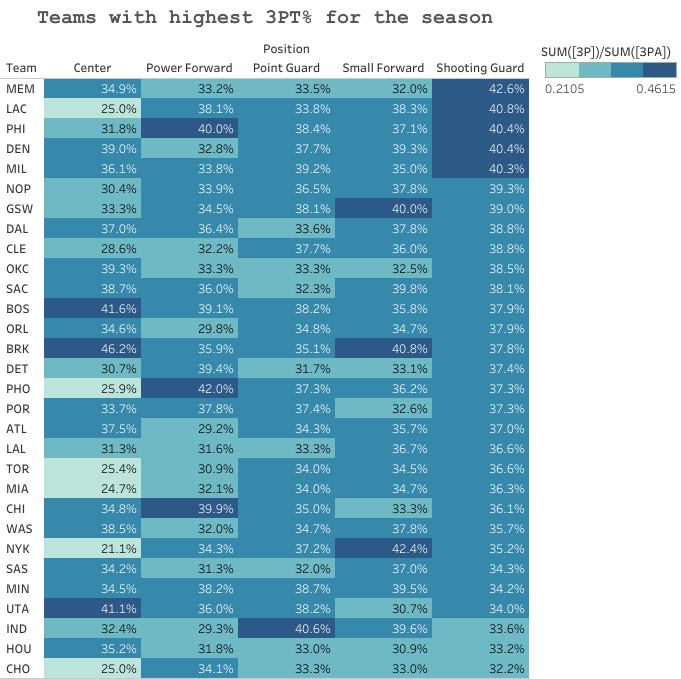
- Which position is most efficient at shooting 3-pointers for each team?
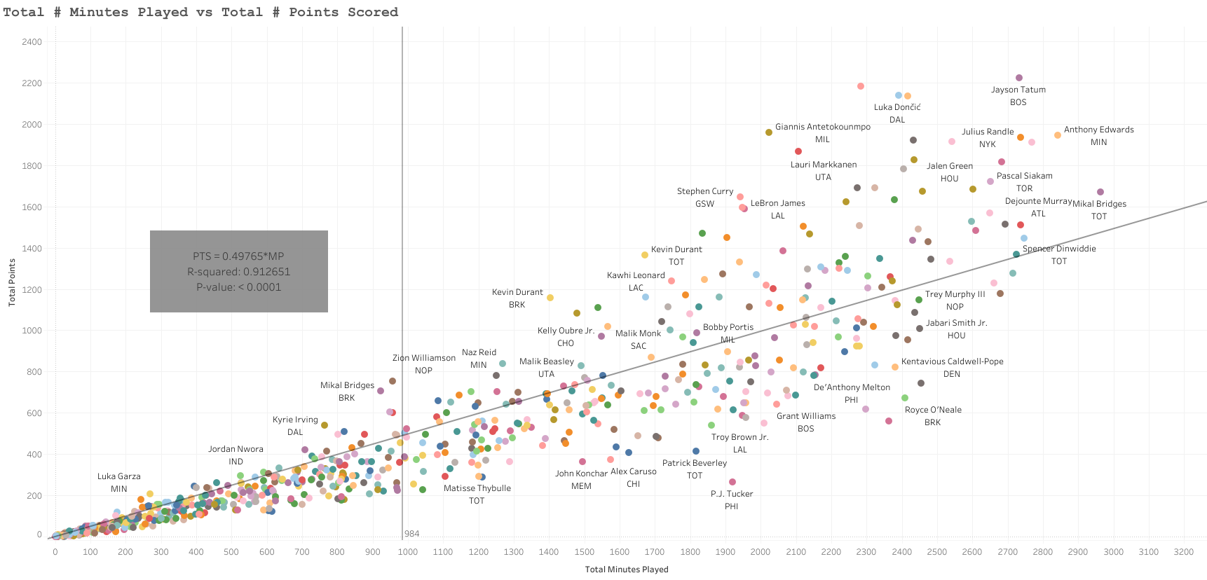
- Does the number of minutes played relate to the total number of points made in a season?
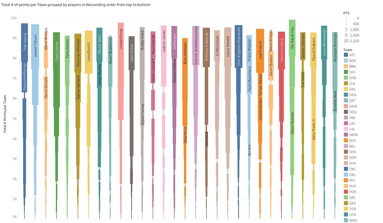
- What were the total points for each team and how much did each player contribute?
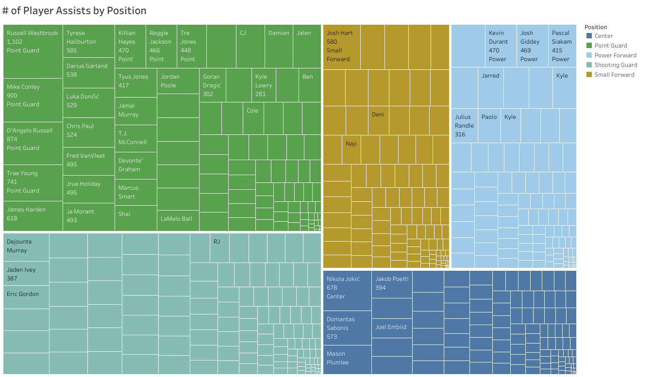
- Which players had the most assists in every position?
- Evaluate a player’s performance throughout the season by examining their points, assists, and total rebounds.
Key Insights
- Shooting guard is the most efficient position at shooting 3-pointers for each team, with 5 of 30 teams ranking in the top quartile.
- 91% of the variation in the number of points a player has in the season is related to the total number of minutes played.
- Sacramento Kings has 9,898 points which is 145 points more than Golden State Warriors, the second-best team.
- Point guard Russel Westbrook (Clippers) has 2.5 times more assists than the second best position and player with the top number of assists.
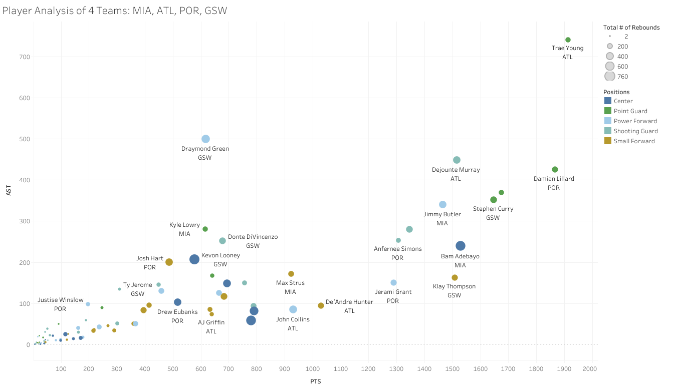
- Atlanta Hawk’s Trae Young is a clear outlier with 741 assists, 1914 points and 217 rebounds.
The Data
Using Tableau, I analyzed player and team statistics to identify areas players and teams could improve in from the start of the season, October 2022 to the championship game, April 2023. The data contains 30 teams with 5 different positions and 539 different players. Although 31 attributes were included in the data dictionary, only the following 9 were used in this analysis.
The data included the following:
- Tm - Team
- Pos - Position
- PN - Player Name
- MP - Minutes Played
- 3P - 3-Pointers Made
- 3PA - 3-Pointers Made
- TRB - Total Rebounds
- AST - Assists
- PTS - Total Points Scored
The Analysis + Commentary
Which position is most efficient at shooting 3-pointers for each team?
Click here to use interactive chart
To answer the question above, I created a heatmap to show the teams with the highest 3-point average split by positions. The heat map shows 5 of the 30 teams (MEM, LAC, PHI, DEN, and MIL) to have 40.3% to 42.6% shooting average for the shooting guard position. The next best position would be center position showing 3 teams with an average 3-point shot from 41.1% to 46.2%. As a result, the shooting guard position is the most efficient position at shooting 3-point shots for each team.
Click here to use interactive chart
Are the number of minutes played related to the total number of points made in a season?
I explored the data further to find if there was a relationship between the number of minutes a player played in the season and the total number of points scored. To do this, I created a scatter plot and drew a trend line using linear regression. Because I knew the total number of points started at the beginning of the season when the first game was played, I forced the y-intercept regression line to start at 0; so, the estimated value of the points when no minutes were played would be 0.
The trendline showed the R-squared value to be 0.912 and the slope to be 0.497. This indicates that 91.2% of the variation in the total number of points made in the season is related to the number of minutes played in the season. The slope also indicates that for each additional minute played the number of points is expected to increase by approximately 49.7%. It was interesting to see this analysis. The data shows a strong positive relationship between the number of minutes played and the total number of points made in a season. Further analysis would be needed to find other relationships and factors that contribute to a player’s total points scored.
Click here to use interactive chart
What were the total points for each team and how much did each player contribute?
To find this, I created a stacked bar chart showing the total number of points per team stacked by players’ total points within the team in descending order from highest to lowest. SAC for instance has 9,898 points which is 145 points more than GSW, the second-best team. The gradual narrowing of the column size shows the player’s points within the total points scored by the team. BOS’s Jayson Tatum has the most points scored out of Boston and overall with 2,225 points in the season.
Which players had the most assists in every position?
Click here to use interactive chart
I chose to answer the question above by using a tree map showing the 5 different positions grouped into larger squares, and within the larger squares are players’ total number of assists. For the Point Guard position and overall positions, Russel Westbrook has 2.5 times more assists compared to the Shooting Guard position’s top number of assists.
Evaluate a player’s performance throughout the season by examining their points, assists, and total rebounds.
Click here to use interactive chart
To answer the following question above, I chose to highlight a few teams from the East and West coast. I created a bubble plot to show the total number of points, assists, and rebounds (indicated by the size of the players’ bubble) for East Coast teams, MIA, ATL, and West Coast teams POR, GSW. Atlanta’s Trae Young is a clear outlier with 741 assists, 1914 points and 217 rebounds.
Insights and Recommendations
I enjoyed exploring the 22-23 NBA season and there are a lot of insights to take away from this analysis. If you enjoyed reading my analysis and are interested in knowing more, please feel free to connect with me on LinkedIn and check out my other projects!